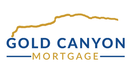
Mortgage Logo with Local Tie In
 We refreshed their company image by incorporating a very well-known mountain range that is a landmark in their area. This tied their mortgage company into the local market. Their older logo had a generic mountain line, we put in their local mountain and made the color gold to match their company name and tightened up the font.


